Landing pages built by AI — real examples

Every page below was built by this generator: the AI wrote the copy, the blocks and photos were picked automatically. Twenty layouts — from strict corporate to editorial and retro print, for different niches and different kinds of business. Open any of them to see what comes out, then build your own — free and without signing up.

Build your own landing page

Twenty landing page templates

Each template is a finished layout with its own character: grid, typefaces and rhythm of blocks. Colours and fonts are adjustable, and if you would rather not choose, the AI picks the layout itself from your description. Below each one you will find the niches it suits — the same registry the generator uses to make that choice.

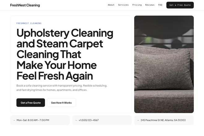
Open example: Fence Repair Service That Restores Strength, Safety, and Curb Appeal

Classic

A plain, light layout with no strong character — the one to take when character would only get in the way. The first screen splits in two: headline and button on the left, a photo on the right. Services and prices go in a table, and nothing competes with the form. Start here if you are unsure: it suits almost any business and never argues with the content.

Good for: services, repairs, delivery, sole traders, small business
Open example: Immigration Attorney Support That Moves Your Case Forward

Minimal

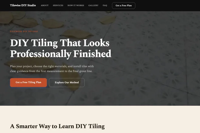
Strict minimalism with a dark header: the first screen carries a full-width photo with the headline sitting over the darkened image. Straight lines, almost no ornament, and noticeably more air between sections than in Classic. Services run as a grid, prices as a table. For those who need to look solid: accounting, legal services, equipment supply, B2B.

Good for: accounting, legal services, equipment, B2B services, supply

Open example: Move Out Cleaning Service That Leaves No Trace Behind

Product

A product page: a centred first screen with a badge above the headline, large rounded corners and a light gradient. The key difference from its neighbours is pricing — plans come as cards with one marked as recommended, instead of rows in a price list. Take it for an app, a subscription or an online service, where people pick a plan and decide fast.

Good for: apps, subscriptions, online services, gadgets, devices

Open example: Payroll Services for Small Business That Keep Every Pay Cycle On Time

Corporate

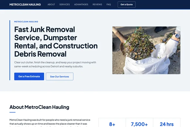
A corporate layout: deep navy text, corners barely rounded, a short kicker above every heading. Services run as a list, prices as a table, and the tone stays businesslike. It differs from Minimal in density — less air, more facts per screen. For construction firms, industry, finance, consulting and transport, where the decision is never made by one person alone.

Good for: construction firms, industry, finance, consulting, transport

Open example: Furniture Assembly Service for Fast, Clean Flat Pack Assembly

Local

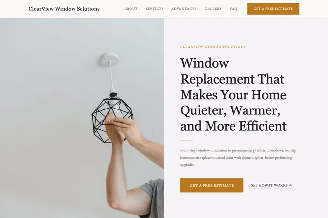
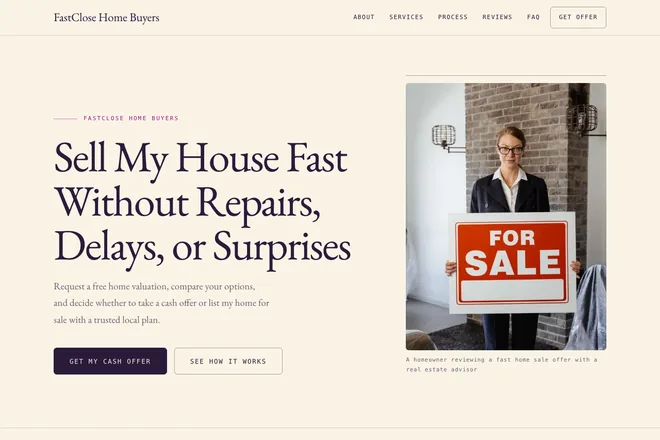
A warm local layout: cream paper background, a serif typeface, a centred first screen. It is the only classic template with serif headings, and that alone gives it a homely voice rather than a corporate one. It suits bakeries, florists, workshops, handmade goods and small neighbourhood shops — businesses chosen by feel, not by a line in a price list.

Good for: bakeries, florists, handmade, local shops, workshops

Open example: Monitored Home Alarm System Protection That Stays Alert 24/7

Dark

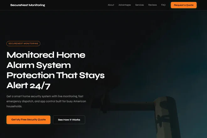
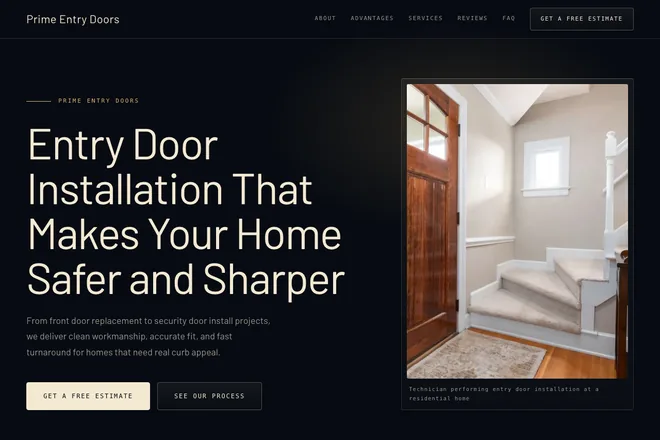
A dark tech layout: black base, a neon accent with a glow, a photo filling the first screen. It is the only dark one among the classics — a light palette must not be put on it, the whole page is built for a dark background. Section headings are marked by a short accent bar. For IT security, esports, streaming, car audio and nightlife venues.

Good for: IT security, esports, streaming, car audio, nightlife

Open example: Online Coding Bootcamp for Real-World Web Developers

SaaS

A light SaaS page: soft gradients, plenty of air, a technical voice without heaviness. Unlike Product, it is built around a service rather than a thing to buy: the emphasis falls on how the process works and what it connects to, not on picking a plan. For startups, CRM, IT outsourcing and mobile development — when you have to explain an unfamiliar service.

Good for: startups, CRM, integrations, IT outsourcing, mobile development

Open example: Bridal Nail Service That Fits the Dress, the Schedule, and the Photos

Luxury

A premium showcase: a gold accent, serif headings, corners barely rounded and the widest gaps between sections in the whole set. Here the air is the device — it makes the offer look expensive before anyone reaches the price. For weddings, spas, boutiques, antiques and private chefs. It works badly when a lot of items have to fit on one screen.

Good for: weddings, spa, boutiques, antiques, private chefs

Open example: Fast Dishwasher Repair Service for Leaks, Noisy Cycles, and Drain Problems

Bold

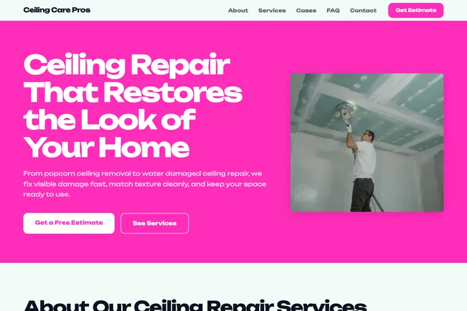
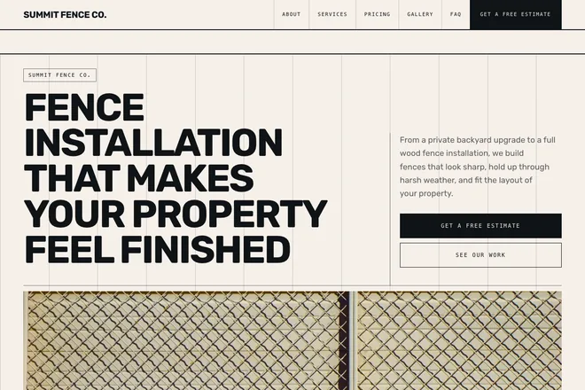
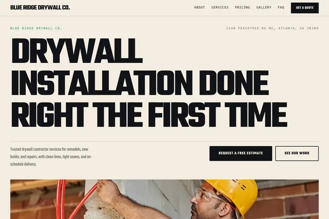
A bold layout built on oversized type and a hard accent colour: the headline takes up the whole first screen and does the work a picture usually does. There is no ornament — the effect rests entirely on scale. For marketing, producing, events, gyms and courses, where you need to hook someone in three seconds rather than explain. Long technical copy will defeat it.

Good for: marketing, producing, events, gyms, courses

Open example: Dip Powder Nails and Press On Sets That Stay Strong for Weeks

Soft

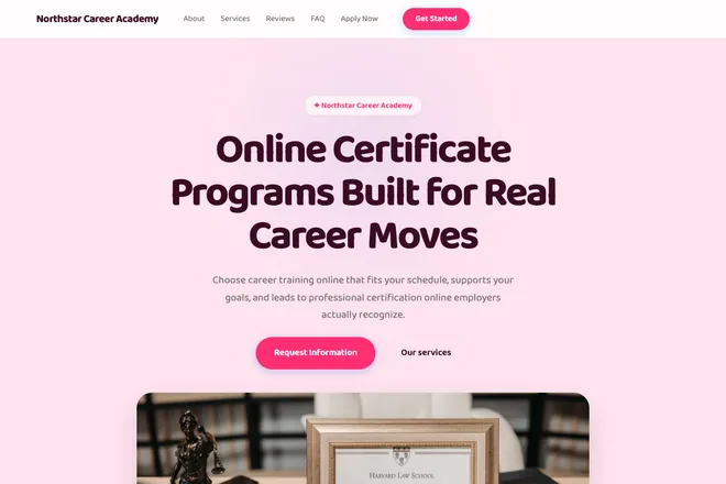
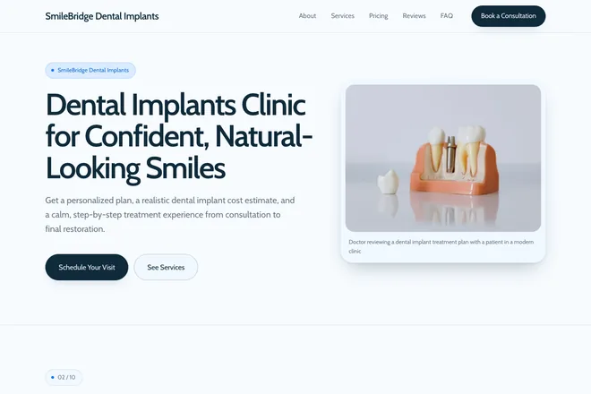
A soft pastel layout with large rounded corners and a calm palette. The voice is friendly and quiet: nothing pushes, nothing hurries — which is exactly right when someone is deciding who to trust with themselves or with their child. For cosmetology, dentistry, massage, yoga and children's centres. The quietest of the classics: it will not sell by pressure.

Good for: cosmetology, dentistry, massage, yoga, kids centres

Open example: Sliding Patio Door Installation and Patio Door Replacement Done Right

Editorial

An editorial, magazine-like layout: wide margins, an asymmetric column grid, a drop cap opening the text, Roman numerals on the sections and hairline rules instead of filled blocks. It is built for reading — long copy looks at home here rather than tiring. For law, architecture, restoration, clinics and wineries, where decisions are made slowly and deliberately.

Good for: law, architecture, restoration, clinics, wine

Open example: Reliable Tile Installation Contractor for Floors, Walls, and Showers

Grid

A Swiss brutalist grid: a rigid twelve-column ruling across the first screen, heavy rules, small caps, giant numerals and square corners. There is one colour, and typography carries everything else. The comparison table is the visual hero here, not a utility block. For manufacturing, construction, logistics and B2B — when you need to look precise rather than welcoming.

Good for: manufacturing, construction, B2B, logistics

Open example: Professional EV charger installation for homes and garages

Neomodern

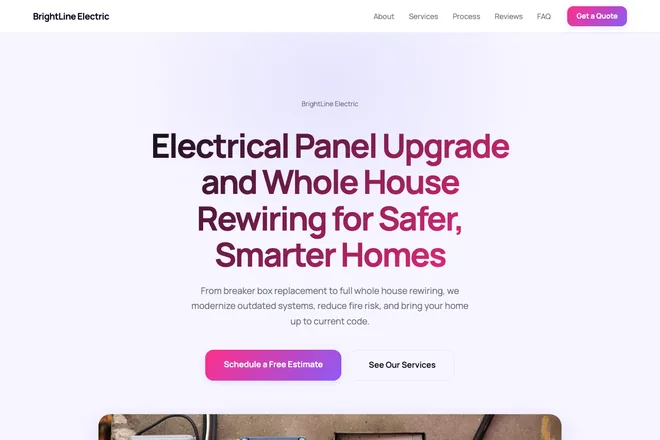
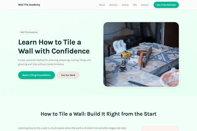
Neomodern in a soft-tech key: gentle two-layer shadows, large radii, pill-shaped badges, plenty of air and light hover animations. The work stages are laid out as a timeline — circles strung on a connecting line. This is the most universal of the designer set: if you want character but not risk, start here. For SaaS, services, healthcare and education.

Good for: SaaS, services, healthcare, education

Open example: Whole Home Renovation Contractor for Full-Scale Home Transformations

Grand

A dark premium showcase: black base, gold accent, translucent glass panels and a pool of light behind the first screen. Prices run as rows with an aligned right-hand column rather than as cards. The layout is built for a dark background — a light palette must not be applied to it. For automotive, real estate, interiors, jewellery and security: expensive purchases, long decisions.

Good for: automotive, real estate, interiors, jewellery, security

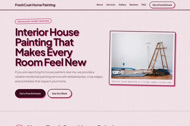
Open example: Interior House Painting That Makes Every Room Feel New

Risograph

Retro risograph printing: two flat inks, grain laid over the whole page, thick frames, hard offset shadows and ovals drawn around the numbers. Buttons and cards press in when clicked, like a stamp into paper. Lively, noisy and deliberately unserious — for coffee shops, barbershops, schools, events and local retail. A bank or a clinic should not take it.

Good for: coffee, barbershops, schools, events, local retail

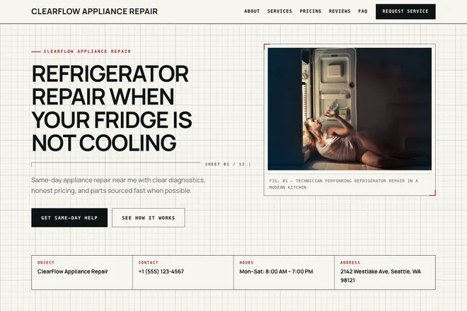
Open example: Garage Door Installation, Repair, and Opener Setup That Work the First Time

Blueprint

An engineering blueprint: graph-paper background, monospaced utility labels, dimension lines carrying the real number of items in a section, and a title block on the first screen holding the phone number, opening hours and address. Corners are square and there is no ornament at all — everything that looks decorative carries data. For engineering, metalwork, IT infrastructure and land surveying.

Good for: engineering, metalwork, IT infrastructure, land surveying

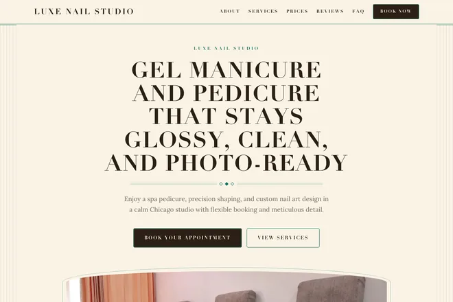
Open example: Men's Hair Color Service for a Clean, Natural Look

Art Deco

Art Deco: strict symmetry, arched tops on the cards, vertical pilasters framing the first screen, gold double rules set with diamonds and stage numbers held inside diamonds. Services are presented as a menu, with dotted leaders running to the price. For beauty salons, restaurants, hotels and premium dentistry. It needs short headings — symmetry does not forgive long ones.

Good for: beauty salons, restaurants, hotels, premium dentistry

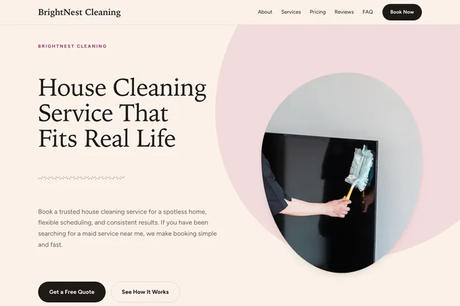
Open example: Professional Cabinet Painting Service That Makes Kitchens Look New

Terracotta

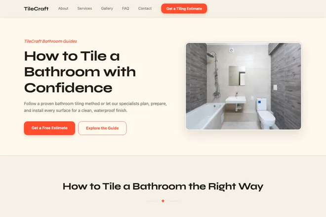
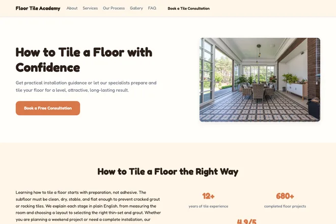
Organic terracotta: a warm palette, teardrop corner radii that mirror between neighbouring cards, wavy dividers between sections and a soft blot behind the first screen. The hero is asymmetric — text on the left, a tall photo on the right. The price sits as a pill right inside the service row. For eco goods, cosmetics, children's brands, wellness and landscaping.

Good for: eco, cosmetics, kids, wellness, landscaping

Open example: Shower Tile Installation That Looks Sharp and Lasts

Bento

An editorial bento mosaic: tiles of different sizes in one grid — a figure, a quote, a service, a photograph — with some inverted in colour. It absorbs any number of cards gracefully: six, nine or twelve all settle evenly, with no gaps left in the tail. Headings carry a small utility line with the section number and tile count. For agencies, digital, consulting and events.

Good for: agencies, digital, consulting, events

Open example: Personal Injury Lawyer Help After an Accident

Maximalism

Typographic maximalism: a headline of some hundred and fifty points running the full width, a marquee assembled from your own keywords, vertical labels beside the section headings. No cards, no filled blocks — only heavy rules and sheer type size. For sports, construction, car tuning, marketing and courses. Mind long words: at this size they break mid-word.

Good for: sports, construction, car tuning, marketing, courses

Examples by type of page

The same generator builds pages for different jobs — what changes is the set of blocks and the emphasis. Here are the four types people ask for most.

Business card site

A short page about a specialist or company: what you do, what it costs, how to get in touch. Three or four blocks, the whole page reads in a minute. Suits a tradesperson, a freelancer, a small studio.

Services page

Services as cards with prices, the order of work step by step, answers to common questions. The main type for salons, service companies and anyone selling work rather than goods.

Portfolio

A showcase of work: a captioned gallery, worked examples with outcomes, testimonials. For a designer, photographer, maker or developer.

Course or event promo

Programme, speakers, schedule and a sign-up button on a single page. For launching a course, a webinar or a dated event.

Finished pages of all these types live in the landing page catalogue: browse the catalogue

What a landing page is made of

A one-page site is always arranged the same way: the main offer at the top, contacts and a request form at the bottom, and in between the blocks that persuade. What changes is not the order but the set.

The fixed part

A first screen with a heading, a subheading and a button, a header with navigation, a contact block and a request form at the bottom. This is on every page regardless of template or settings.

Optional blocks

10 blocks, of which up to 6 go on a page: advantages, services with prices, stages of work, worked examples, a price table, testimonials, a gallery, a text block for search engines, common mistakes and a comparison with the alternative. Pick none and the AI takes the ones that suit your niche.

What the AI decides

The copy for every block, which sections to use, photos for the subject and a colour palette to match the chosen layout. Photos come from a stock library under a licence that allows commercial use; replace them with your own before you publish.

What you can change in a template

A template sets the grid and the rhythm, not the colour. Before generation you can change the palette and the typeface — pick them yourself or press “suggest”, and the AI proposes a combination for your niche and the chosen layout: a light scheme will not end up on a dark template.

After generation you can change everything else, because you get the source code. It is plain HTML, CSS and PHP with no build tools and no lock-in: open the file, edit the text or the colour, upload it to your own hosting. No website builder gives you that on a free plan.

How to build one like this

The whole thing takes a couple of minutes, and no sign-up is needed.

Describe your business in keywords

A few lines: what you do, what you sell, which city you are in. The more precise the words, the better the AI picks the copy, the layout and the photos.

Pick a template or let the AI choose

Twenty ready layouts for different niches, with adjustable colours and font. Choose nothing and the AI picks one from your keywords.

Take the finished page

A couple of minutes later the page is assembled: copy written, blocks arranged, photos picked. Open the link and download the archive.

Create a landing page free

Guides on building and improving websites →

Questions about templates and examples

Can I use a template for free, including for a client?

Yes. Generation is free, and the template and the finished page become yours with no conditions: use them for your own business, for a client, or rework them for another job. There is one limit — 2 generations per visitor in the last 24 hours.

How many templates are there and how do they differ?

Twenty. Ten classic ones — universal light layouts for mainstream niches: services, repairs, delivery, healthcare. Ten designer ones with a character of their own: an editorial grid, a Swiss grid, art deco, an engineering drawing, retro print. They differ in grid, typefaces and rhythm of blocks; the set of sections and the form logic are the same in all of them.

Can I change the design after generation?

Yes, though not with a button in the interface — by editing the code. You download an archive with the page, the styles and the scripts: colours and fonts sit as variables at the top of the stylesheet and can be changed in any text editor. If you want to change them before generation, pick the palette and the typeface on the form.

Are these examples real or mocked up?

Real. Every page in the examples was built by this same generator from keywords, exactly the way yours will be. The AI wrote the copy and picked the photos; we did not rewrite them by hand.

Need a working site, not a draft?

The generator builds a page in a minute. But a domain, your own photos, copy with real prices and leads actually reaching you — that part is done by hand, and I do it:

Hosting and domain

Server, SSL, email, moving it to your own domain

from $50 1–2 days

Tailored to your business

Your copy, photos, logo and brand colours

from $100 1–3 days

More functionality

Extra sections, forms, calculators, integrations. A shop, payments and user accounts — quoted per project

from $300 from a week

Ads and SEO

Ad campaigns, search optimisation, analytics

from $200 per month

Prices are for the work itself. The ad budget is paid separately: it goes straight to the ad platform, not to me.

Full table — how much a website costs: what the price includes and what changes it.

The first step is free: I look at what you got, and tell you what it takes to go live, how long it will take and what it will cost. No strings attached.